Briefly
Conducted in-depth research by observing employees and identifying software limitations.
Addressed critical financial inaccuracies in the old UI, preventing revenue loss.
Implemented color-coded pricing sections and streamlined currency conversion in the new design.
Balanced simplicity with necessary complexity in response to user feedback.
Delivered a user-friendly, efficient software solution tailored to specific company needs.
Gained valuable insights into user-centered design and effective project management.


— for Makromek
— for Makromek
— for Makromek
Efficient Accounting and Inventory Management: Cost Savings Through Intuitive Design
Efficient Accounting and Inventory Management: Cost Savings Through Intuitive Design
Efficient Accounting and Inventory Management: Cost Savings Through Intuitive Design
At Makromek, I was hired to design their internal accounting and inventory software, Makrosabe, aiming to streamline processes and reduce budgets for several services. My role as a designer was not just about creating a user-friendly interface, but also about deeply understanding and addressing the needs of the employees who would be using the software daily.
At Makromek, I was hired to design their internal accounting and inventory software, Makrosabe, aiming to streamline processes and reduce budgets for several services. My role as a designer was not just about creating a user-friendly interface, but also about deeply understanding and addressing the needs of the employees who would be using the software daily.
At Makromek, I was hired to design their internal accounting and inventory software, Makrosabe, aiming to streamline processes and reduce budgets for several services. My role as a designer was not just about creating a user-friendly interface, but also about deeply understanding and addressing the needs of the employees who would be using the software daily.


I began by immersing myself in Makromek’s work environment, observing employees' interactions with the old software, and identifying their pain points. This direct engagement was crucial in understanding the intricacies of their workflows and the limitations of the existing system. Their feedback revealed a need for a more detailed and manageable approach to inventory, current account control, and invoice generation.
I began by immersing myself in Makromek’s work environment, observing employees' interactions with the old software, and identifying their pain points. This direct engagement was crucial in understanding the intricacies of their workflows and the limitations of the existing system. Their feedback revealed a need for a more detailed and manageable approach to inventory, current account control, and invoice generation.
I began by immersing myself in Makromek’s work environment, observing employees' interactions with the old software, and identifying their pain points. This direct engagement was crucial in understanding the intricacies of their workflows and the limitations of the existing system. Their feedback revealed a need for a more detailed and manageable approach to inventory, current account control, and invoice generation.


During the design process, I discovered and addressed a critical issue in the old software's UI that led to financial losses due to incorrectly entered selling prices. I discovered that its lack of visual distinction in the user interface led to critical errors, such as incorrectly entering selling prices lower than the purchase prices. To resolve this, I redesigned the inventory interface, implementing color-coded sections for selling (green) and purchasing prices (red). This visual distinction not only reduced errors but also enhanced data clarity. Additionally, I introduced a separate section for discounted prices (blue) to allow sales below the purchase price without triggering error messages.
During the design process, I discovered and addressed a critical issue in the old software's UI that led to financial losses due to incorrectly entered selling prices. I discovered that its lack of visual distinction in the user interface led to critical errors, such as incorrectly entering selling prices lower than the purchase prices. To resolve this, I redesigned the inventory interface, implementing color-coded sections for selling (green) and purchasing prices (red). This visual distinction not only reduced errors but also enhanced data clarity. Additionally, I introduced a separate section for discounted prices (blue) to allow sales below the purchase price without triggering error messages.
During the design process, I discovered and addressed a critical issue in the old software's UI that led to financial losses due to incorrectly entered selling prices. I discovered that its lack of visual distinction in the user interface led to critical errors, such as incorrectly entering selling prices lower than the purchase prices. To resolve this, I redesigned the inventory interface, implementing color-coded sections for selling (green) and purchasing prices (red). This visual distinction not only reduced errors but also enhanced data clarity. Additionally, I introduced a separate section for discounted prices (blue) to allow sales below the purchase price without triggering error messages.


The new design was initially met with some resistance due to its simplicity compared to the old, complex software. Recognizing the importance of user comfort and familiarity, I adapted the design to strike a balance between simplicity and the required detail.
The new design was initially met with some resistance due to its simplicity compared to the old, complex software. Recognizing the importance of user comfort and familiarity, I adapted the design to strike a balance between simplicity and the required detail.
The new design was initially met with some resistance due to its simplicity compared to the old, complex software. Recognizing the importance of user comfort and familiarity, I adapted the design to strike a balance between simplicity and the required detail.


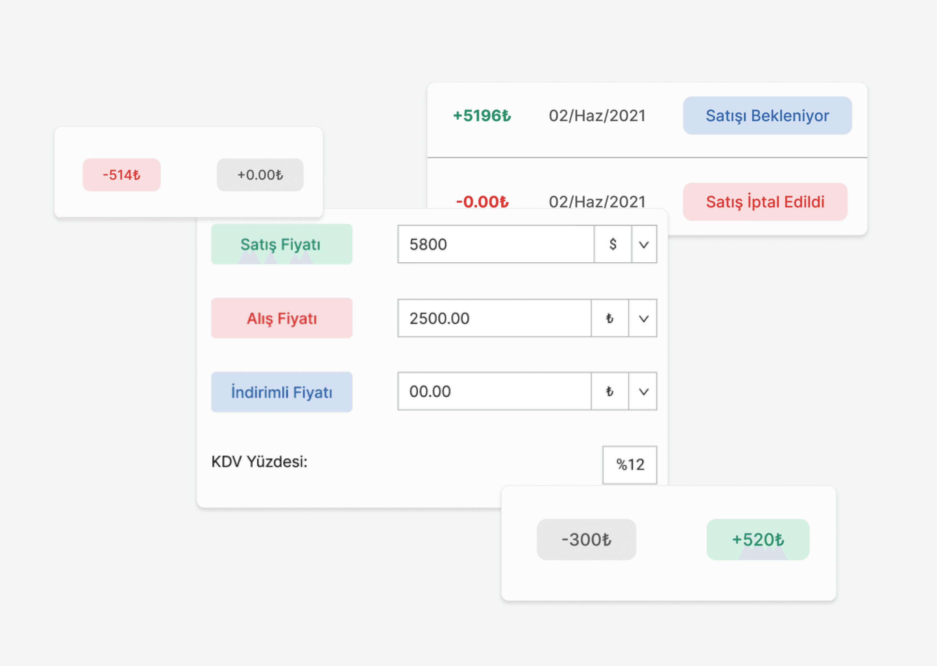


The impact of these changes was substantial. We significantly reduced revenue loss by preventing incorrect pricing entries and implemented a bold color scheme to highlight profit and loss, aiding in quick and effective business performance assessment. The new design also led to reduced time and effort in reading crucial data, streamlining the company's operations.
The final product significantly reduced the potential for revenue loss and removed unnecessary features, leading to a more efficient and user-friendly experience. The project not only resulted in a bespoke software solution tailored to Makromek’s needs but also served as a profound learning experience in user-centered design and project management.


This project at Makromek illustrates my ability to empathize with users, identify and solve critical problems, and deliver design solutions that are both functional and intuitive. My role in this project was integral in transforming the company's internal processes and setting a new standard for their software systems.
This project at Makromek illustrates my ability to empathize with users, identify and solve critical problems, and deliver design solutions that are both functional and intuitive. My role in this project was integral in transforming the company's internal processes and setting a new standard for their software systems.
This project at Makromek illustrates my ability to empathize with users, identify and solve critical problems, and deliver design solutions that are both functional and intuitive. My role in this project was integral in transforming the company's internal processes and setting a new standard for their software systems.


Briefly:
Identified and addressed gaps in museum experiences with digital solutions.
Conducted research and developed a visitor-centric app.
Designed and tested features such as personalized feeds and interactive maps.
Through non-intrusive and informative adverts in the app, we encouraged the purchase of annual subscriptions.
Gained valuable experience for future design roles.
Conducted in-depth research by observing employees and identifying software limitations.
Addressed critical financial inaccuracies in the old UI, preventing revenue loss.
Implemented color-coded pricing sections and streamlined currency conversion in the new design.
Balanced simplicity with necessary complexity in response to user feedback.
Delivered a user-friendly, efficient software solution tailored to specific company needs.
Gained valuable insights into user-centered design and effective project management.
More to Explore →
More to Explore →


Enhancing the Museum Experience through Digital Context and Personalized Journeys
Enhancing the Museum Experience through Digital Context and Personalized Journeys
—for Ministry of Culture and Tourism
—for Ministry of Culture and Tourism
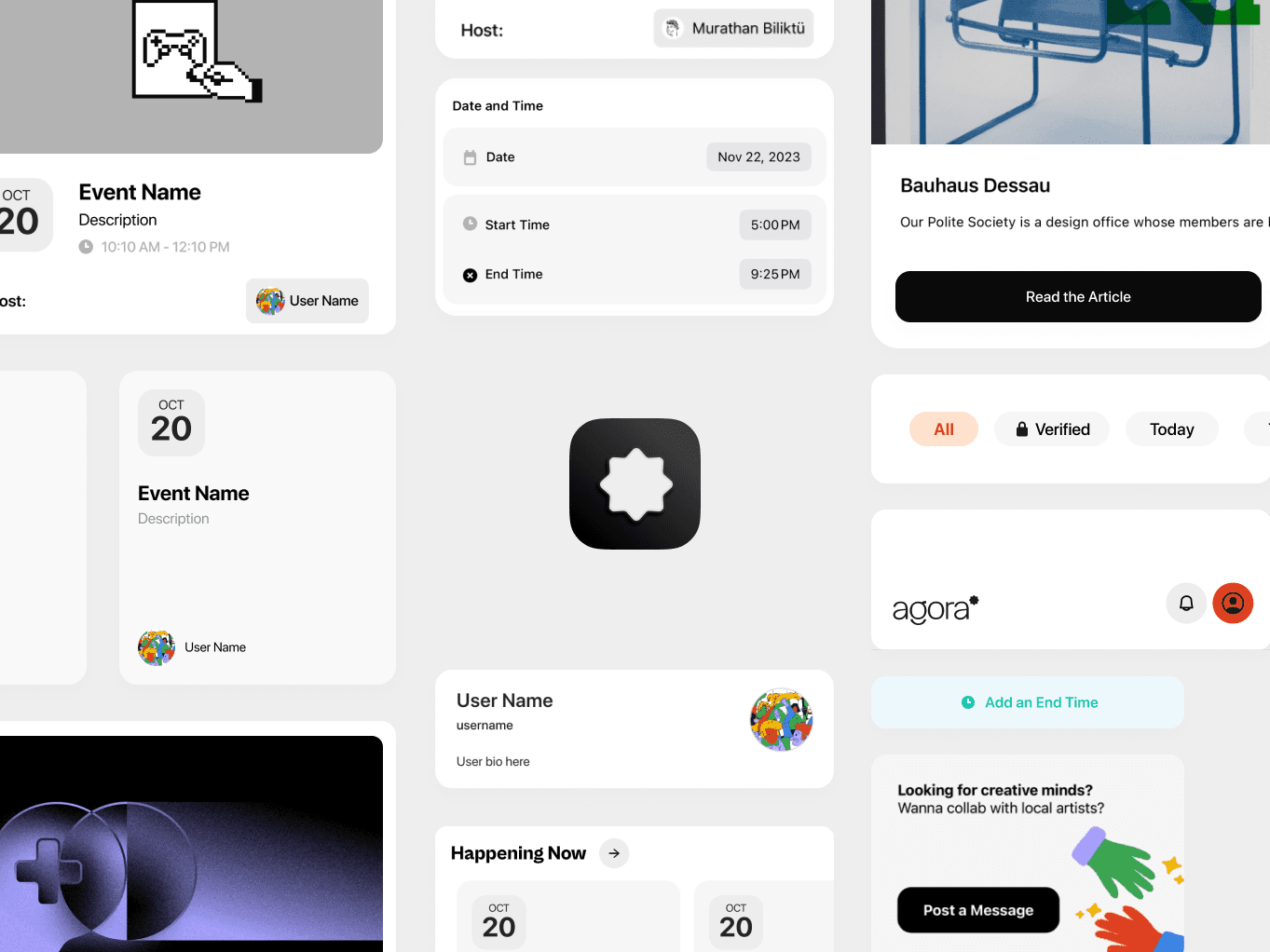


Crafting a Design System through Code-First Thinking
Crafting a Design System through Code-First Thinking
— for Agora Design Foundation
— for Agora Design Foundation
His work has been recognized by It's Nice That, Best Graphic Design of the Year, Page Magazine, and Print Magazine
Murathan Biliktü
©2025
His work has been recognized by It's Nice That, Best Graphic Design of the Year, Page Magazine, and Print Magazine
©2025
Murathan Biliktü
His work has been recognized by It's Nice That, Best Graphic Design of the Year, Page Magazine, and Print Magazine
Murathan Biliktü
©2025
