Briefly
Identified and addressed gaps in museum experiences with digital solutions.
Conducted research and developed a visitor-centric app.
Designed and tested features such as personalized feeds and interactive maps.
Through non-intrusive and informative adverts in the app, we encouraged the purchase of annual subscriptions.
Gained valuable experience for future design roles.
See the Design System
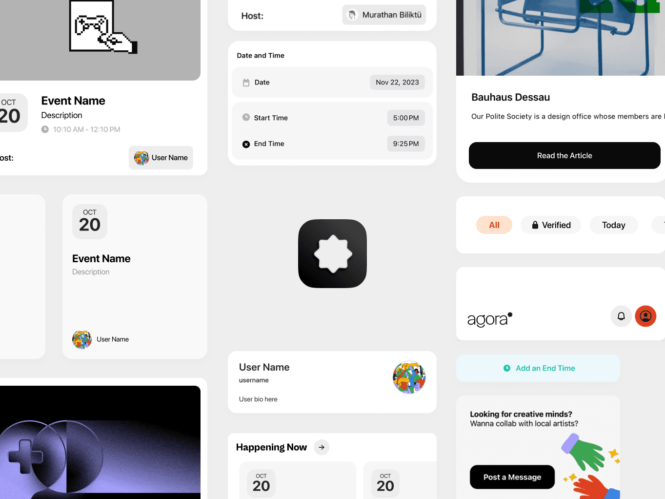


— Agora Design Foundation
— Agora Design Foundation
— Agora Design Foundation
Buidling a Design System for Scalable Platforms by thinking with code
Buidling a Design System for Scalable Platforms by thinking with code
Buidling a Design System for Scalable Platforms by thinking with code
While I was working on a project called Board, it became clear that we needed something robust to keep our design consistent and scalable. That's when the idea of Agora started taking shape in my mind.
While I was working on a project called Board, it became clear that we needed something robust to keep our design consistent and scalable. That's when the idea of Agora started taking shape in my mind.
While I was working on a project called Board, it became clear that we needed something robust to keep our design consistent and scalable. That's when the idea of Agora started taking shape in my mind.
During my time with Board, I kept running into the same issue: how do we keep everything looking and feeling coherent? It was more than just making things look good; it was about how users interacted with the platform. This was my 'aha' moment. I realized we didn't just need to tweak what we had; we needed a whole new approach. That's where Agora began - a design system that could grow with us and adapt to different needs, something that would speak to users directly.
During my time with Board, I kept running into the same issue: how do we keep everything looking and feeling coherent? It was more than just making things look good; it was about how users interacted with the platform. This was my 'aha' moment. I realized we didn't just need to tweak what we had; we needed a whole new approach. That's where Agora began - a design system that could grow with us and adapt to different needs, something that would speak to users directly.
During my time with Board, I kept running into the same issue: how do we keep everything looking and feeling coherent? It was more than just making things look good; it was about how users interacted with the platform. This was my 'aha' moment. I realized we didn't just need to tweak what we had; we needed a whole new approach. That's where Agora began - a design system that could grow with us and adapt to different needs, something that would speak to users directly.
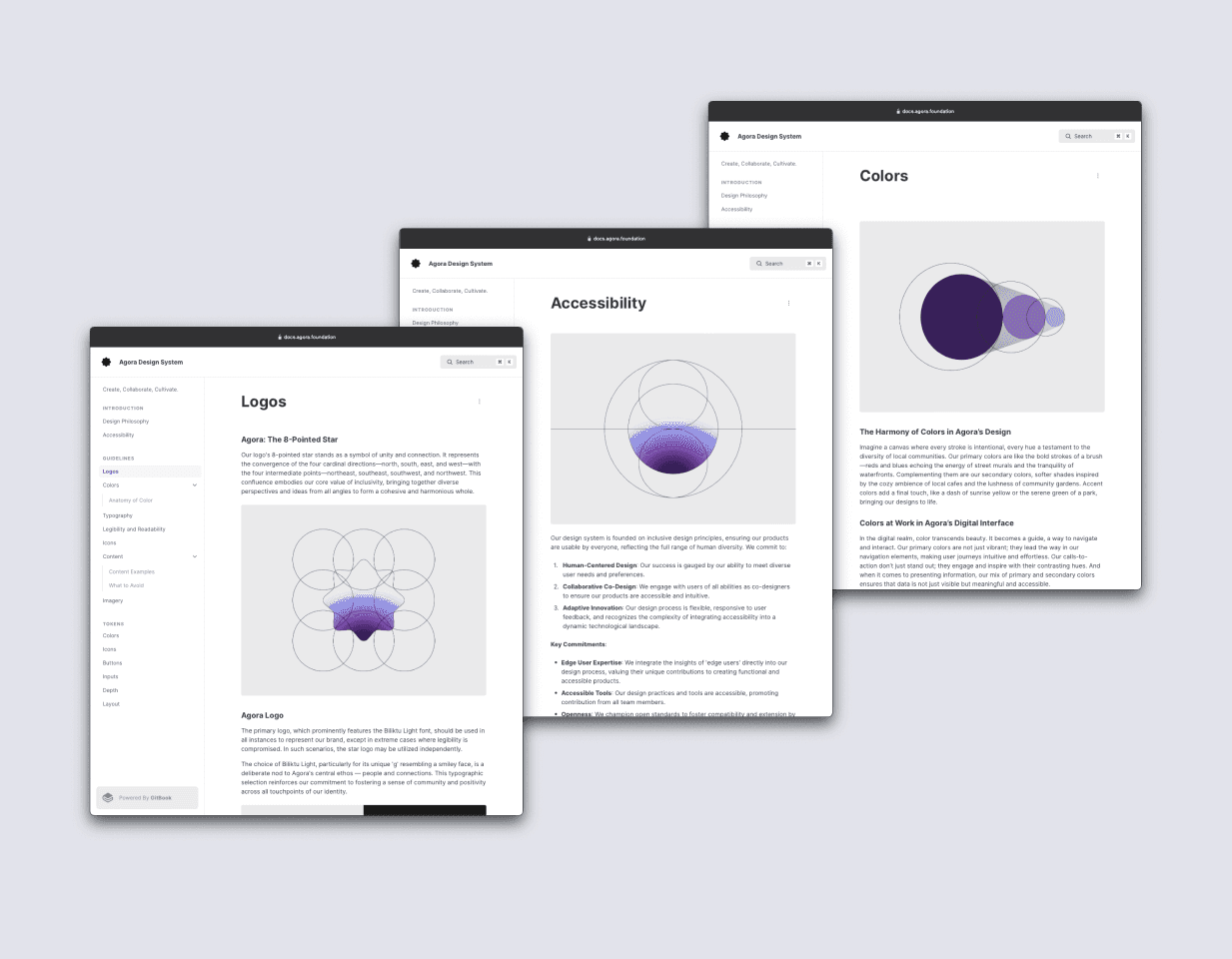


The creation of Agora's logo, an 8-pointed star, was a deliberate choice to symbolize unity and connection, mirroring our core values of inclusivity. This was complemented by the selection of Biliktu Light font, chosen for its unique and friendly 'g', embodying Agora’s ethos of fostering connections and prioritizing people.
Creating Agora was all about staying true to one core idea; design for people. This tenet was guiding every choice, from the tiniest button to the overall layout. I wanted to make sure that Agora wasn't just functional but also approachable and relatable. The goal was always to create an experience that felt natural and intuitive to the user.
Developing Agora wasn’t smooth sailing. Trying to balance broad design principles with specific user needs was tough. Every challenge, though, was a chance to learn. Whether it was tweaking a design based on user feedback or keeping up with the latest framework updates... In the end these challenges turned into something helpful that will help us build products more easy and fast.
Developing Agora wasn’t smooth sailing. Trying to balance broad design principles with specific user needs was tough. Every challenge, though, was a chance to learn. Whether it was tweaking a design based on user feedback or keeping up with the latest framework updates... In the end these challenges turned into something helpful that will help us build products more easy and fast.
Developing Agora wasn’t smooth sailing. Trying to balance broad design principles with specific user needs was tough. Every challenge, though, was a chance to learn. Whether it was tweaking a design based on user feedback or keeping up with the latest framework updates... In the end these challenges turned into something helpful that will help us build products more easy and fast.
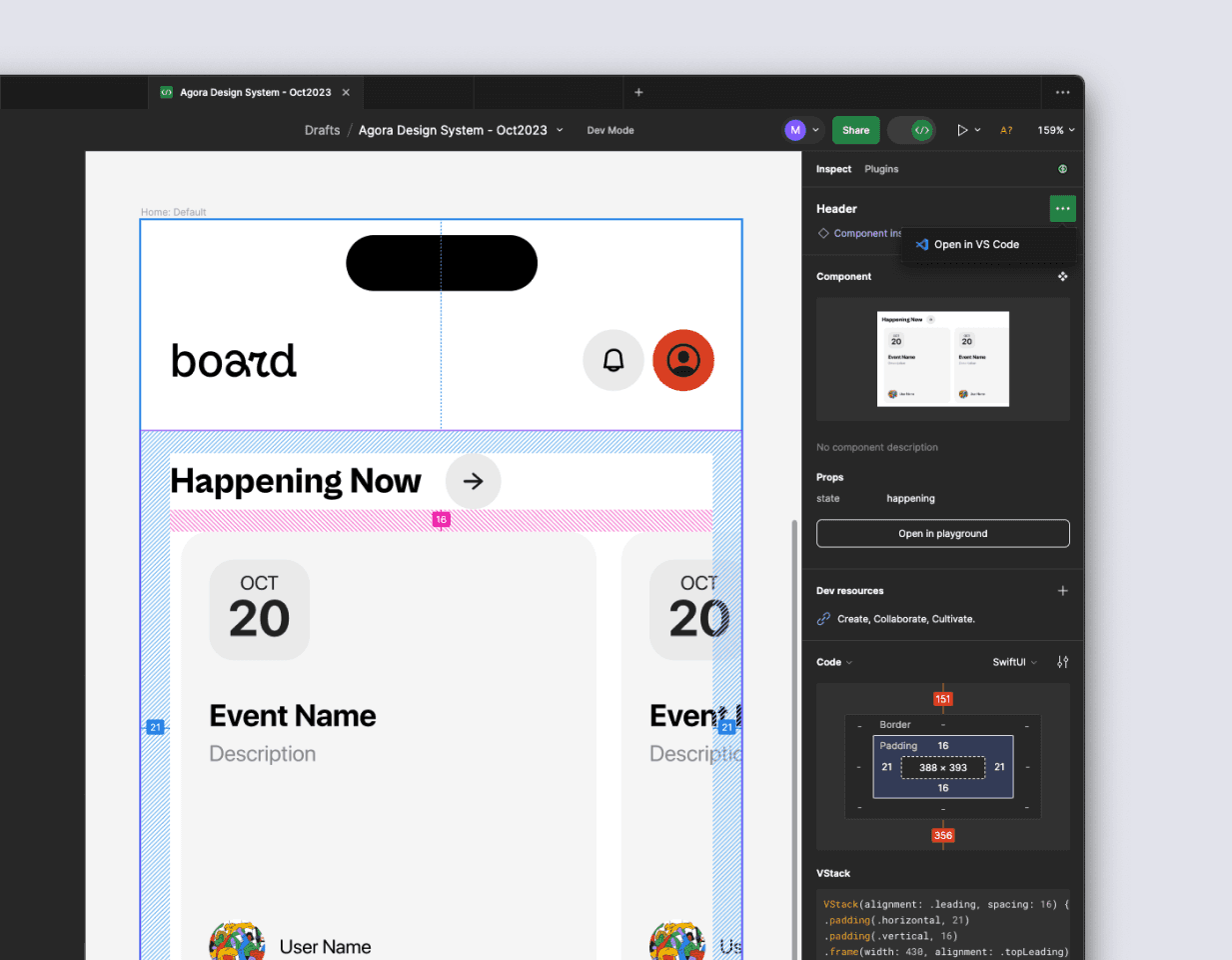


When building Agora, one of the key things I focused on was building the system both in Figma and in code right from the start. This was really important for making sure it was not only great in theory but also really workable in practice. Basically, for every design bit I did in Figma, there was a piece of code to match it.
When building Agora, one of the key things I focused on was building the system both in Figma and in code right from the start. This was really important for making sure it was not only great in theory but also really workable in practice. Basically, for every design bit I did in Figma, there was a piece of code to match it.
When building Agora, one of the key things I focused on was building the system both in Figma and in code right from the start. This was really important for making sure it was not only great in theory but also really workable in practice. Basically, for every design bit I did in Figma, there was a piece of code to match it.
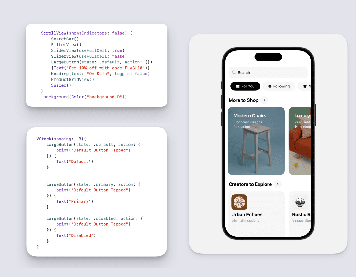


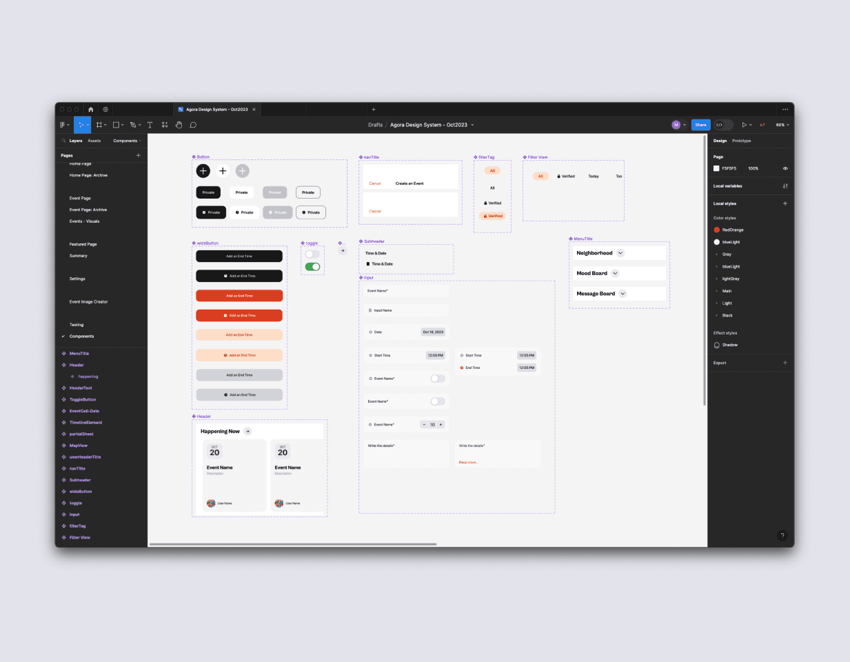


From my previous design system experiences, this way of working helps the design and development teams work together smoothly. It was about making sure everyone who might use this design system in the future will be on the same page. In the end Agora wasn't just a static design system; it was something that could grow and change as needed, keeping up with new tech and what our users needed. Doing things this way really highlights how I like to approach design – it's all about bringing together the looks, the usability, and the nuts and bolts of coding to make something that's not just cool but really works in the real world.
From my previous design system experiences, this way of working helps the design and development teams work together smoothly. It was about making sure everyone who might use this design system in the future will be on the same page. In the end Agora wasn't just a static design system; it was something that could grow and change as needed, keeping up with new tech and what our users needed. Doing things this way really highlights how I like to approach design – it's all about bringing together the looks, the usability, and the nuts and bolts of coding to make something that's not just cool but really works in the real world.
From my previous design system experiences, this way of working helps the design and development teams work together smoothly. It was about making sure everyone who might use this design system in the future will be on the same page. In the end Agora wasn't just a static design system; it was something that could grow and change as needed, keeping up with new tech and what our users needed. Doing things this way really highlights how I like to approach design – it's all about bringing together the looks, the usability, and the nuts and bolts of coding to make something that's not just cool but really works in the real world.
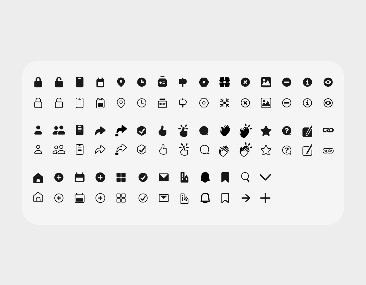
The iconography in Agora was crafted to be both intuitive and informative, playing a vital role in our design language. I ensured that the color, naming, and scalability of our icons were in harmony with our typefaces and overall design ethos, making them an integral part of the user interface.
A key aspect of Agora's adoption was providing a suite of Figma community files, including an Icon Library and Illustration Library. These resources were designed to align seamlessly with Agora’s components, styles, and icons, making it easy for newcomers to grasp the design philosophy.


Each project I've undertaken has sharpened my problem-solving skills. I approach challenges with innovation and creativity, turning potential obstacles into opportunities for growth and improvement. This mindset was essential in overcoming the unique challenges of creating Agora.
My past experiences have instilled in me the importance of sustainability in design. I focus on creating systems that are not just effective today but can evolve over time. This long-term vision was key in the scalable and sustainable design of Agora.
Briefly:
Identified and addressed gaps in museum experiences with digital solutions.
Conducted research and developed a visitor-centric app.
Designed and tested features such as personalized feeds and interactive maps.
Through non-intrusive and informative adverts in the app, we encouraged the purchase of annual subscriptions.
Gained valuable experience for future design roles.
Read the Booklet
Read the Booklet
More to Explore →
More to Explore →
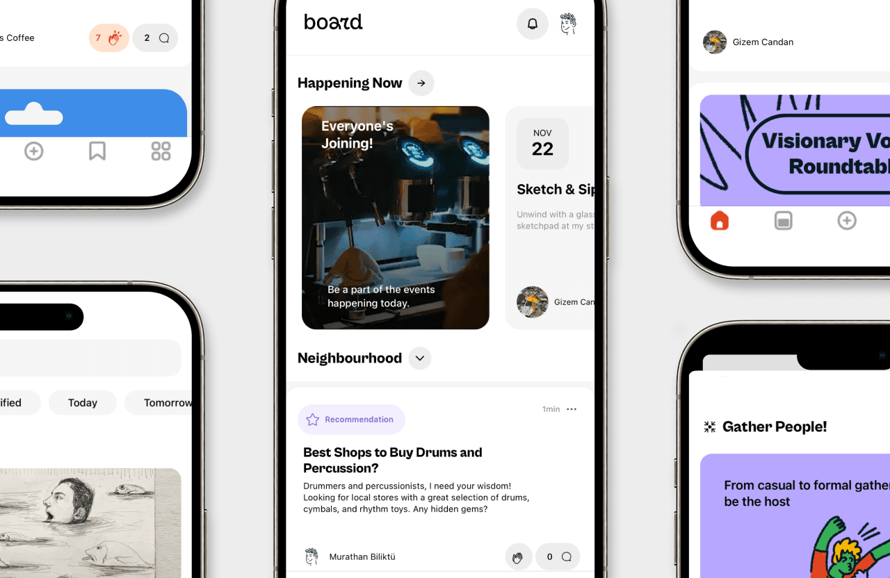


Connecting Local Creators and Building a Product from the Ground Up
Connecting Local Creators and Building a Product from the Ground Up
—for Board
—for Board
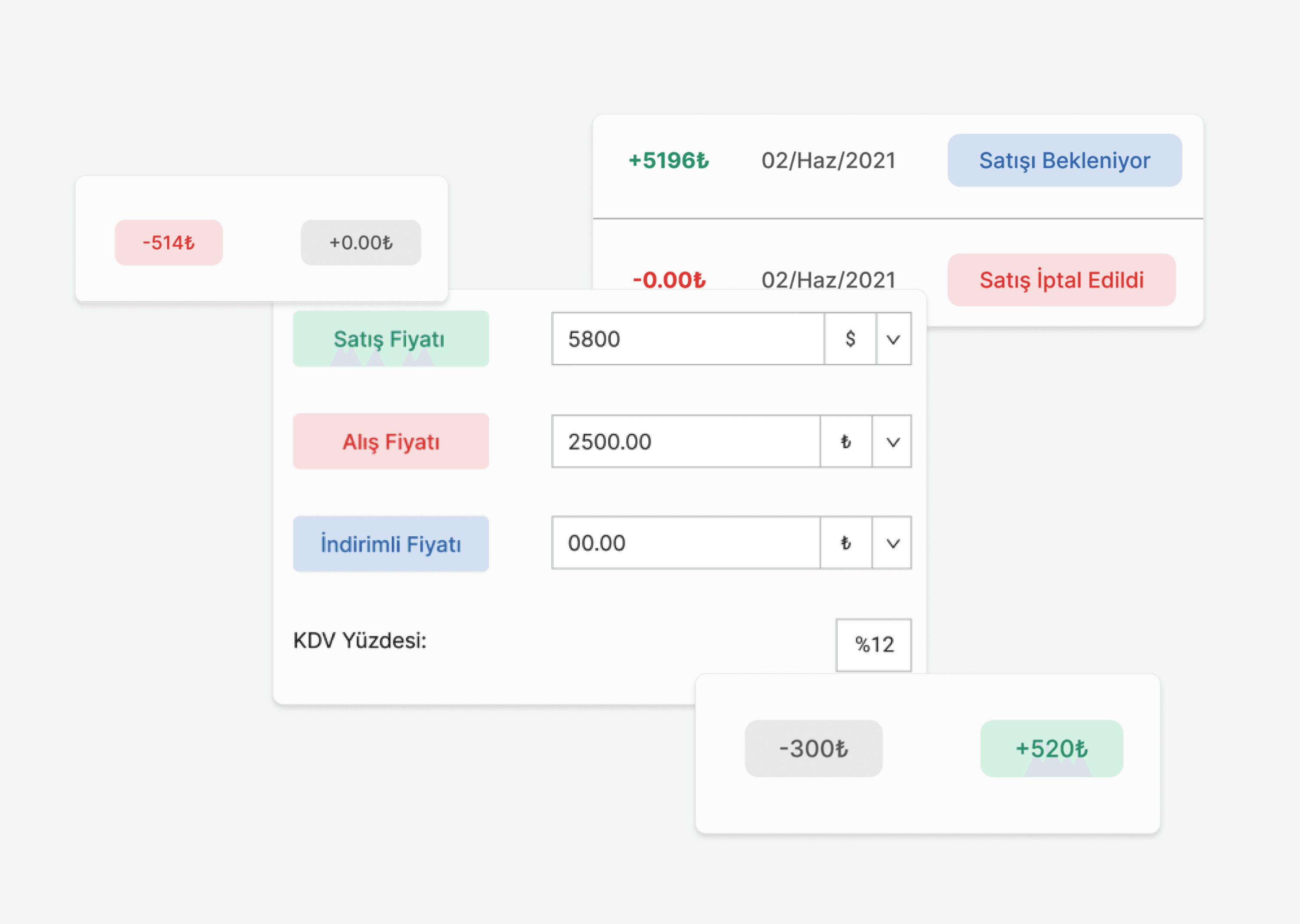


Efficient Accounting and Inventory Management: Cost Savings Through Intuitive Design
Efficient Accounting and Inventory Management: Cost Savings Through Intuitive Design
— for Makromek
— for Makromek
His work has been recognized by It's Nice That, Best Graphic Design of the Year, Page Magazine, and Print Magazine
Murathan Biliktü
©2025
His work has been recognized by It's Nice That, Best Graphic Design of the Year, Page Magazine, and Print Magazine
©2025
Murathan Biliktü
His work has been recognized by It's Nice That, Best Graphic Design of the Year, Page Magazine, and Print Magazine
Murathan Biliktü
©2025
